MoMA has just acquired 23 digital typefaces for its Architecture and Design Collection. Some are of everyday use, like Verdana; others are familiar characters in our world, like Gotham, which was used in President Obama’s election campaign, or OCR-A, which we can find at the bottom of any product’s bar code; and others are still less common, but exquisitely resonant, like Walker or Template Gothic.
Helped by a panel of expert advisors that included graphic design critics, designers, and historians, we based our decisions on the same criteria—ranging from aesthetics to historical relevancy, from functionality to social significance, from technological ingenuity to economy—that we use when evaluating objects. We paid particular attention to the synthesis of goals, means, and elegance that we always seek in modern design.
This first selection of 23 typefaces represent a new branch in our collection tree. They are all digital or designed with a foresight of the scope of the digital revolution, and they all significantly respond to the technological advancements occurring in the second half of the twentieth century. Each is a milestone in the history of typography. These newly acquired typefaces will all be on display in Standard Deviations, an installation of the contemporary design galleries opening March 2 on the third floor.
The digital fonts, like most objects in the design collection, are commercially available design products. As such, they can be purchased from the original producers—aptly called foundries. The fonts are akin to, say, an iPod, a Braun clock, or a Konstantin Grcic chair. MoMA has either purchased them or obtained them as gifts, but the copyright and the right to sell a user’s license remain with the original manufacturer.
Type Design and MoMA’s Collection
Type design follows the history of object and building design throughout the centuries; it similarly reflects social developments, advances in materials and means of production, cultural biases, and technological progress. Just like the design of artifacts and buildings, in the past two centuries type design has grappled with the industrial revolution first, and the digital revolution later. Just like architecture and object design, type design has had Modernist and postmodernist phases; like other designers, type designers have felt the need to find new inspiration in traditional examples, in the vernacular, and in popular culture. Type is a design universe unto itself, an essential dimension in the history of modern art and design. Typefaces—the building blocks of information printed or displayed onscreen—are design in and of themselves, even before they are used.
And yet, aside from a very important example—the 36-point Helvetica Bold lead type designed by Max Miedinger in 1956—previously there were no typefaces in MoMA’s collection. We did have a rich collection of works produced using typography in innovative, elegant, and unconventional ways, for example the exceptional, recently exhibited collection of posters from the Neue Typographie movement. However, the design units in those works, so fundamental in our collection of design, were missing. The best of them belong in MoMA’s collection, and although we are beginning with the digital era, we intend to work backwards to document the entire twentieth century.
The 23 acquired typefaces are:
• American Type Founders OCR-A (1966)
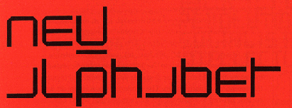
• Wim Crouwel New Alphabet (1967)
• Matthew Carter Bell Centennial (1976-78)
• Matthew Carter ITC Galliard (1978)
• Erik Spiekermann FF Meta (1984-1991)
• Zuzana Licko Oakland (1985)
• Jeffery Keedy Keedy Sans (1991)
• Erik van Blokland and Just van Rossum FF Beowolf (1990)
• Barry Deck Template Gothic (1990)
• P. Scott Makela Dead History (1990)
• Jonathan Hoefler HTF Didot (1991)
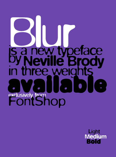
• Neville Brody FF Blur (1992)
• Jonathan Barnbrook Mason (1992)
• Matthew Carter Mantinia (1993)
• Tobias Frere-Jones Interstate (1993-95)
• Matthew Carter Big Caslon (1994)
• Albert-Jan Pool FF DIN (1995)
• Matthew Carter Walker (1995)
• Matthew Carter Verdana (1996)
• Jonathan Hoefler and Tobias Frere-Jones Mercury (1996)
• Matthew Carter Miller (1997)
• Jonathan Hoefler & Tobias Frere-Jones Retina (1999)
• Jonathan Hoefler & Tobias Frere-Jones Gotham (2000)Historical Background on the Evolution of the Digital Typefaces Proposed for Acquisition
Experimentation in the digital realm began in the 1960s, prompted at times by the problems faced as computers became more mainstream. For example, businesses needed to find ways to process information efficiently, and in 1966 OCR-A, the first machine-readable typeface, was adopted as a standard. Also at this time, screens were introduced as windows into the inner workings of a computer—the first real interfaces. Letterpress and Linotype (hot metal) machines gave way to early CRT (cathode ray tube) monitors and photographic reproduction technology. Inspired by this, Wim Crouwel proposed New Alphabet (1967), an experimental typeface designed to take CRT monitors into account when setting type on a computer. In the second half of the 1980s, a new revolution spurred by the Macintosh home computer took Crouwel’s experiment further. Zuzana Licko was among the first to create typefaces made of pixels and composed of dots on a grid, meant to be used onscreen, and to be printed on early dot-matrix printers.
As computer programs for type design became more sophisticated in the 1990s, designers felt free to experiment in ways that had not been possible before—for instance, creating a typeface from a laundromat sign, as Barry Deck did when he designed Template Gothic (1990), or designing a new typeface, as Jeffery Keedy did in 1991 because the fonts available did not satisfy his needs as a graphic designer. Even the history of typography got special treatment in this era, becoming a repository of timeless and universal ideas ready to be updated, while popular culture provided familiarity, closeness, and a collection of idiosyncratic curiosities ready to be re-imagined, from highway signs to punk leaflets. Just like in music and fashion, mash-ups of existing typefaces were mixed with homages to stonecutters of the past—P. Scott Makela’s Dead History (1990) and Jonathan Barnbrook’s Mason (1992) are good examples.
Those were exciting and euphoric times for designers, with heated debates lighting up conferences and journals. On the one hand, some designers were bent on pushing the limits of visual communication one character at a time—as in the intentionally out-of-focus letters of Neville Brody’s Blur (1992) or the randomized outlines of LettError’s Beowolf (1990)—and on defining the postmodern in type design. On the other hand, some designers continued the modernist quest for uniformity and clarity. Erik Spiekermann’s Meta (1984-1991) and Albert-Jan Pool’s redesign of the German standard typeface, DIN (1995), were formidable successors to the “classic” and oft-used typeface Helvetica.
What We Chose and Why
We chose some of these typefaces because they are sublimely elegant responses to the issues of specific media. For example, typefaces like Bell Centennial, Mercury, Miller, and Retina were all designed to be printed on newsprint, with cheap ink and in small sizes.
In many cases, advances in technology influenced the aesthetics of type. We have tried to form a comprehensive collection of the most elegant solutions to typography design in the midst of the digital revolution; typefaces like OCR-A, Oakland, New Alphabet, Verdana, and Beowolf address the span of twentieth-century type-design solutions, from CRT monitors to programming and the Internet.
Typography has a special relationship with its own past, with frequent redesigns and revivals, from among which we chose the ones that most inventively distill the essence of historical examples to give it new, contemporary life—as in HTF Didot, Galliard, Big Caslon, Mantinia, and DIN. Others, like Dead History, reference the past, but reinterpret it in new ways.
Lastly, several of the fonts we chose visually reflect very closely the time and place in which they were made. Interstate and Gotham are purely late-twentieth-century American faces, celebrating vernacular type by making it exquisitely contemporary. Walker, Meta, Blur, Keedy Sans, Mason, and Template Gothic are all faces that represent a specific era in the digital revolution—the early 1990s, when digital typography was coming into its own. They were chosen based upon their importance to cultural history as well as their experimental aesthetics.
@mrjyn
July 20, 2011
MoMA | 23 New Digital Fonts in MoMA Collection


via moma.org