Reset this favorite; show all Subscribe options
Subscribe Now!
...with web-based podcatchers. Click your choice below:


...with iTunes:
...via email:
Get Dogmeat █ Roiling vortex of LUST █ delivered by email
...with something else (copy this address):
Get more info on other podcatchers:


A podcast is rich media, such as audio or video, distributed via RSS. Feeds like this one provide updates whenever there is new content. FeedBurner makes it easy to receive content updates in popular podcatchers.
Learn more about syndication and FeedBurner...
A message from the podcast publisher: █ Dogmeat! █ A rolling vortex of lust for the disease called Rock-Roll!█ http://whatgetsmehot.posterous.com/rss.xml
Current Feed Content
-
see me morph into Kim Jong Il
Posted: Tue, 28 Jun 2011 20:45:00 -0700


-
best taiwanese betel nut tits
Posted: Tue, 28 Jun 2011 20:44:00 -0700

-
Favorite Newton
Posted: Tue, 28 Jun 2011 20:41:00 -0700

-
my bedroom
Posted: Tue, 28 Jun 2011 20:40:00 -0700

-
Actual customer letter #963
Posted: Tue, 28 Jun 2011 20:38:00 -0700

-
L'Oreal (i was surprised too!)
Posted: Tue, 28 Jun 2011 20:37:00 -0700

-
stretching+exercise
Posted: Tue, 28 Jun 2011 19:37:00 -0700
![[stretching+exercise+#1+-+page+1.JPG]](https://blogger.googleusercontent.com/img/b/R29vZ2xl/AVvXsEgYG-sdgRMZYP_pEK4G5iGl1OefOySd0gBNbRFzns0VawT_hF0L_64U-gwi7hPwpaajTfFh4oEcRKVcdoBN8u7GKBkPtp1QRsJprFLuzR8_qCUR-MLCpLR9UgiSDLQ8GxkStQEQhg/s1600/stretching+exercise+%231+-+page+1.JPG)
-
Lonneke - Hottest Guess Model Ever? Yes!
Posted: Tue, 28 Jun 2011 18:28:00 -0700

-
creepy things said re. separate vacations (a list in progress)
Posted: Tue, 28 Jun 2011 12:35:00 -0700


-
Best pic of the day? YES! 2
Posted: Mon, 27 Jun 2011 20:33:00 -0700
-
Go BIG with Jean-Luc Godard Birthday Font!
Posted: Mon, 27 Jun 2011 19:59:00 -0700
Bon Anniversaire, Jean-Luc!
Our favourite director turns
EIGHTY, and we want to celebrate
(with) him, with everyone.
We were always in love with the title sequence lettering to Godard's movies Made in U.S.A. and 2 ou 3 choses que je sais d'elle. So as an hommage to Jean-Luc, to the Nouvelle Vague, to Seberg, Karina, Faithfull & Cie., we present you our Jean-Luc typeface, as a birthday gift for everyone. Voilà!
We didn't find out who originally made the lettering for these two movies. Some speculate it could have been Godard himself - Godard's interest in graphic design and typography is clear, with many of his other films employing such strong typography-only titles and intertitles. They are almost a self-sufficient entity, another character in the movie, another comment.
This style of lettering is so interesting to us because it is such a clear renunciation of the "pretty", classical title screens that were common in that time's more conservative films. It has a more vernacular and brutishly low-brow character; this lettering comes from the street:
We can not prove this at all, but we think it may be derived from the stencil letters of the Plaque Découpée Universelle, a lettering device invented in the 1870s by a certain Joseph A. David, and first seen in France at the 1878 Exposition Universelle, where it found broad appeal and rapid adoption. We think this style of lettering was absorbed into the public domain vernacular of French lettering, and that the 2 ou 3 choses titles are derived from these quotidien lettering style, as it would seem to fit Godard's obsession with vernacular typography.
We learned about the PDU through Eric Kindel's article in Typography Papers 7. In 2009, then-Werkplaats Typografie student Dries Wiewauters surprised us with a revival of the Plaque Découpée Universelle.
Below, the JeanLuc alphabet (white) and the PDU alphabet (blue), to show similarities and differences.

You can get the typeface right here, in two styles, for Desktop and Web use:
I'm an iPhone user, show me the licence on a separate page.
Atelier Carvalho Bernau, Font Software End User Licence Agreement (Freeware Fonts)
v1.2, 2010-11-29This is an agreement between you, the downloader, and Atelier Carvalho Bernau, located at Hoge Zand 36a, 2512 EM The Hague, The Netherlands. In accepting the terms of this agreement, you acknowledge understanding and promise to comply with its terms. If you do not accept the terms, please do not complete the download.
What you are getting from Atelier Carvalho Bernau is the licence to use digital typeface software - hereafter "fonts" - free of charge on computers within your organization; the copyright to the design of the fonts remains with Atelier Carvalho Bernau. These fonts are NOT available under "Open Source", "Creative Commons", "Open Font Licence" or other kinds of "open" licences.
COPYING, SHARING, MULTIPLYING
You are allowed to make archival copies of the fonts for your own purposes and we recommend that you do so. Please, do not distribute the fonts to people outside of your organization under any circumstances. That means putting them for download on a server that is accessible from outside your organisation, file sharing, uploading, bundling on a CD-ROM or other physical media.
This typeface is available free of charge from the website http://www.carvalho-bernau.com/jlg and we will be glad if you link to this site, but you are not granted the right to offer the fonts for download yourself.
As an exception to this, using the fonts for @font-face/CSS is allowed under certain conditions, see below at "Embedding".
Furthermore, a copy of the fonts may be sent to a prepress bureau or printing office with a print job you used the fonts for.
EMBEDDING
The fonts can be embedded in other software files, such as Portable Document Format (PDF) or Flash files, but you will take all reasonable care to embed the fonts in such a way that they cannot be extracted from the files you create. Web-embedding is allowed under this licence with Cufon and sIFR, and with @font-face and CSS it is permitted using the .woff, .eot, the special version of the .otf and .svg fonts we provide (not with the normal .otf fonts), under the condition that following immediately under the @font-face declaration block of the CSS file, or under the javascript call statements of your web pages, or equivalent, you append this text as a comment in the source code:
"The Jean-Luc typeface was designed and made by Atelier Carvalho Bernau on the occasion of the 80th birthday of Jean-Luc Godard. It is available free of charge from http://www.carvalho-bernau.com/jlg/
Jean-Luc typeface Copyright (c) 2010 Atelier Carvalho Bernau"NO MODIFICATIONS, PLEASE.
The typefaces are our copyright, and licensing does not permit you to modify the fonts for your own purposes, or to execute modifications of our fonts for third parties. You may not modify, or commission a third party to modify, the fonts without first gaining permission from Atelier Carvalho Bernau. You may not sell or give away modified versions of the fonts.
Excluded from this are conversions necessary for Cufon and sIFR web embedding only.
CREDIT
If and where design is credited in publication colophons, website colophons et cetera, where you employ this typeface, it must be credited like this: "Typeface(s): Jean-Luc by Atelier Carvalho Bernau, http://carvalho-bernau.com"
Technical issues, warranty, limited liability
We have done everything we can to produce our fonts to the highest and most up-to-date technical standards, and we test the fonts extensively in the latest versions of technically-compliant applications. However, the font is provided "as is", without warranty of any kind, express or implied, including but not limited to the warranties of merchantability, fitness for a particular purpose and noninfringement. In no event shall Atelier Carvalho Bernau be liable for any claim, damages or other liability, whether in an action of contract, tort or otherwise, arising from, out of or in connection with the software or the use or other dealings in the software.
TERMINATION OF LICENCE
If you fail to comply to the terms of this licence, we reserve the right to terminate your licence, and without any restitution. In this case, you will have to delete all copies of the fonts.
GOVERNING LAW
This agreement shall be governed by the laws in force in The Netherlands and the European Union.
FINALLY
We grant the rights of use of our fonts to you in good faith, and ask that you adhere to the terms of this agreement to the best of your ability, and in good faith.
Ok, that's all we wanted to say. Thanks for reading. Bon anniversaire, Jean-Luc!
The typeface has been sent to your email address.
You will receive the fonts in the mail (.otf, .woff, .eot and .svg). We hate spam as much as the next person and would never send you any. We don't have a mailing list, so we will only use your email address to send you a notification in case we update these typefaces. Surprised with the amount of downloads, we have to retract this statement. We simply have no idea how to process that many addresses.
Please note that the typeface will be emailed automatically to the address you enter, so may we suggest a real email address? Also, most throwaway email addresses, such as the ones from mailinator, don't work: They don't allow large enough attachments for us to deliver the mail.
Typeface design, website design and art direction: Atelier Carvalho Bernau. Design intern: Bernd Volmer. Web programming: Dan Powers. Technical consultant: Type Supply.
Further reading: Godard's Intertitles by Andrea Hyde, on the Walker design blog; The 'Plaque Découpée Universelle': a geometric sanserif in 1870s Paris by Eric Kindel, in Typography Papers 7; Dries Wiewauter's revival of the Plaque Découpée Universelle and his versions of the lettering they produce; the book Roger Excoffon et la fonderie Olive by S. Chamaret, J. Gineste, S. Morlighem; this video of Laura Forde's presentation of her thesis Objects to be Read, Words to be Seen: Design and Visual Language in the Films of Jean-Luc Godard 1959-1967; and of course, Godard's Made in U.S.A and 2 ou 3 choses que je sais d'elle and their respective title sequences on YouTube: 2 ou 3 choses que je sais d'elle, Made in U.S.A.
Laura Forde, "Jean-Luc Godard's Critical Appropriation of Graphic Design in the 1960s" (2010 D-Crit Conference) from D-Crit on Vimeo.
The films of Jean-Luc Godard have been written about perhaps more than any other cinematic works, often through the lens of cultural theory, but not nearly enough attention has been paid to the role of designed objects in his films. Collages of art, literature, language, objects, and words, Godard's films have an instant, impactful, graphic quality, but are far from simple pop artifacts. The thesis this presentation derives from, "Objects to be Read, Words to be Seen: Design and Visual Language in the Films of Jean-Luc Godard 1959-1967," explores and interprets the role of visual language within the films-title sequences, intertitles, handwritten utterances, and printed matter in the form of newspapers, magazines, and posters. By examining le graphisme within the cultural context of Paris during the 1960s, this thesis seeks to amplify the significance of graphic design in Godard's first fifteen films, beginning with 1960's À Bout de Souffle (Breathless) and ending with 1967's Weekend. While Godard was not a practicing graphic designer in the traditional sense, he was an amateur de design, an autodidact whose obsession with designed objects, graphic language and print media resulted in the most iconic body of work in 1960s France. --- The School of Visual Arts MFA Design Criticism Department presented "Crossing the Line: The 2010 D-Crit Conference" organized by graduating D-Crit students at the SVA Theatre in New York City on Friday, April 30 2010.


-
☠♞✺⌂⊉: Midnight Party Graphic Identity
Posted: Mon, 27 Jun 2011 19:34:00 -0700
We have a great permanent collection exhibition up right now called Midnight Party, organized by Joan Rothfuss, Adjunct Curator, with Eric Crosby, Curatorial Assistant. It's a beautiful and diverse show, filled with "art whose content is primarily spiritual, visionary, enigmatic, or dreamlike-in a word, subjective." Check out a creepy and mesmerizing video promo of the exhibition here.
An interesting theme from the show deals with our attempts to impose logical structures onto illogical and subjective ideas. To that end, the graphic identity is a loose interpretation of Freud's "dream rebus"-a series of seemingly unrelated images, a pictorial composition, that are the key to decoding the meaning of a dream.
"The dream-thoughts are immediately comprehensible, as soon as we have learnt them. The dream-content, on the other hand, is expressed as it were in a pictograph script, the characters of which have to be transposed individually into the language of the dream-thoughts. If we attempted to read these characters according to their pictorial value instead of according to their symbolic relation, we should clearly be led into error. Suppose I have a picture-puzzle, a rebus, in front of me. It depicts a house with a boat on its roof, a single letter of the alphabet, the figure of a running man whose head has been conjured away, and so on. Now I might be misled into raising objections and declaring that the picture as a whole and its component parts are nonsensical. A boat has no business to be on the roof of a house, and a headless man cannot run. Moreover, the man is bigger than the house; and if the whole picture is intended to represent a landscape, letters of the alphabet are out of place in it since such objects do not occur in nature. But obviously we can only form a proper judgment of the rebus if we put aside criticisms such as these of the whole composition and its parts and if, instead, we try to replace each separate element in some way or other. The words which are put together in this way are no longer nonsensical but may form a poetical phrase of the greatest beauty and significance. A dream is a picture-puzzle of this sort and our predecessors in the field of dream-interpretation have made the mistake of treating the rebus as a pictorial composition: and as such it has seemed to them nonsensical and worthless." -Freud, The Interpretation of Dreams
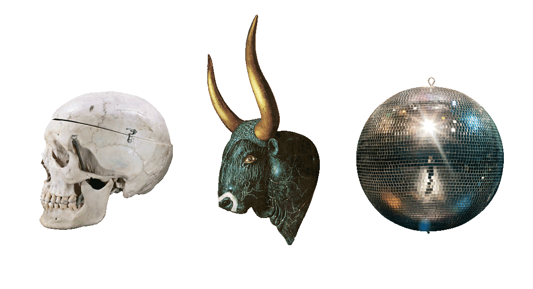
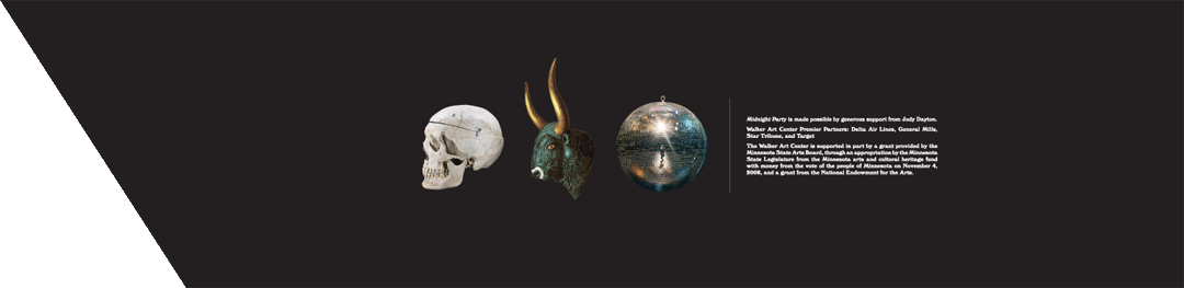
Presented on color backgrounds, the objects evoke the retro natural history museum vibe that infuses the show, suggesting artifacts, mythology, and science. Another reference point (especially for the type) was an encyclopedia/magazine of the occult called Man, Myth & Magic. Both title graphics for the show feature a rebus of three objects each, seemingly random, though begging decryption. The groupings evoke hieroglyphics-an alphabet that refuses to abstract itself completely, instead grafting a second meaning on top of the objects, a system of somewhat subjective relationships that needs to be decoded to be understood. We asked our Facebook fans to guess the name of the exhibition based solely on the skull, cow, and disco ball rebus, and they came up with some great suggestions. Maybe we should start crowd sourcing our exhibition titles . . .
For the Card Catalogue brochures (pictured above), the relationship between the object and the featured artwork was more direct. A shell makes an appearance in Guy Maddin's film, the Minoan bull suggests Sterbak's meat dress, and the timer refers to Strassheim's forensic-like attention to light and exposure. The show also features two great audio guide tours, one called "Shadows" and one called "Visions".
Title graphics:
We had a good time shopping for some of these objects to photograph. A few things we purchased but didn't use: a small boat anchor ($10), a creepy hotel key ($3), a 550 Million year old trilobyte ($5), and a pair of meat hooks ($10) that I keep in my office now to freak people out.
(Dylan & Cameron at Hunt & Gather.)


-
operetta for dogs, starring dogs
Posted: Mon, 27 Jun 2011 19:32:00 -0700
Every dog has its day as the saying goes. This is particularly true on Thursday, July 21st, when Machine Project presents Tragedy on the Sea Nymph, an operetta in three acts starring an all-dog cast in Walker Open Field. All canines are welcome!
Written and Directed by Elizabeth Cline, Tragedy on the Sea Nymph is a 10 minute silent film starring dogs who perform the romance and tragedy of clandestine lovers shipwrecked at sea. The film will be accompanied by five opera singers and the Cedar String Quartet. Dog lovers, share this trailer with all your friends. And mark your calendar now so you and your dog aren't left standing in the dog park when you could be at the opera.
Tragedy on the Sea Nymph Thursday, July 21 9:15 and 9:30 pm, Walker Open Field FREE!
Rain Date: Friday, July 22 9:15 and 9:30 pm (Plastic baggies will be provided.)

-
Design » Godard's Intertitles
Posted: Mon, 27 Jun 2011 19:31:00 -0700
E: Hey, where's that blog post you were going to finish two weeks ago?
A: I, uh, have been working on it.
E: Really? It looked to me like you were watching movies.
A: I was refreshing my memory.
E: Uh huh. What's this post about then?
A: It's about Jean-Luc Godard. And it's done.Stills selected from Pierrot le fou, 1965 ↑
Jean-Luc Godard, arguably the most radical of the Nouvelle Vague filmmakers, is an artist whose imaginative typographic title sequences, intertitles, still and animated imagery inspires me as a designer. Posted here, are stills selected from four of his films from the mid- to late 1960s.
_______________
Godard inserts text and image into a variety of contexts, including, but not limited to: handwritten letters, neon signs, shop signage, book and magazine covers, collages, grafitti, posters, cinema marquees, corporate logos, the pages of comic books, advertisements, newspapers, children's books and political pamphlets. Pierrot le fou (above) is rich with contextualized text. Its narrative is reinforced by the images of handwritten letters between protagonists, signs from the places they travel, and a book called, "La bande des pied nickelés," a cartoon about a group of ne're-do-wells who make their living scamming the bourgeois. Cropped and blinking neon signs highlight specific words, or segments thereof (e.g. "Riviera" becomes "vie), a mercurial device well-suited to Pierrot le fou. Overall, the embedded texts add meaning and beauty to the film, with patterns of live action and still text reminiscent of a graphic novel. There are few purely typographic titles in this film, but all have dotted upper case "I"s and capital letters centered on black backgrounds-the default Godardian style-set in Antique Olive, a face newly developed in the early '60s by Fonderie Olive.
_______________
Stills selected from Masculin féminin: 15 faits précis, 1966 ↑
In Masculin féminin, Godard begins to use purely typographic intertitles, a break from earlier films' embedded texts (e.g. the book cover argument between lovers in Une femme est une femme, 1961), or alternating texts and titles (e.g. Les Carabiniers, 1963 and Alphaville, une étrange aventure de Lemmy Caution, 1965). Devoid of imagery, these intertitles look like "title cards" from the silent film era. Unlike silent film titles-which provide dialog and narration-the content both reflects the thoughts of the protagonists and comments on the culture-at-large, addressing film, politics, and commercialism. Like previous films, Godard continues to play with language. Letters drop in and out to reveal new words, as in the the closing title, when "Féminin" becomes "Fin." Formally, the titles are consistent: dotted upper case "I"s and centered justified text on black backgrounds, likely set in a custom version of Futura with a shortened "M" centre vertex. The film, shot in flat black and white, manages beautifully with white text.
_______________
Stills selected from La Chinoise, 1967 ↑
Though stylistically more similar to Pierrot le fou than to Masculin féminin, the intertitles in La Chinoise continue Godard's move toward the politicized texts he continues to use into the '70s and '80s. His presentation of images and titles reads like a manifesto, eerily predicting the political unrest of May 1968. The inclusion of embedded texts (e.g. color swatches, pages from comic books and political publications) reduces the contrast between mise en scène and intertitle. The contrast is also blurred as texts are altered, presumably by narrator or protagonist: 1) colored markers decorate a Karl Marx caricature, 2) suction cup arrows attack a collage of French thinkers and revolutionaries, and 3) "défendre" is crossed-out in favor of "trahir." Large, cropped portions of books and newspapers highlight specific words, and function both as embedded text and typographic intertitle.
_______________
Stills selected from Le Weekend, 1967 ↑
In Le Weekend, Godard returns to the purely typographic titles last seen in Masculin féminin. He inserts line breaks, shifts color, repeats titles and uses graphic elements (e.g. the crossed-out "Front de Libération de Seine at Oise") to play with words, numbers, and their meanings. "Analyse," broken into two lines, serves as the chapter title for an explicit pseudo-psychoanalytic scene in the beginning of the film. "Photographie" is cleverly renamed "Fauxtographie," and is made more striking by strictly justifying the text letter-for-letter, achievable with an H/I hybrid letterform. There is even a speedometer, tracking the protagonists' km/h throughout the film. Blue, white and red text is a common Godardian palette, usually referring to American cultural hegemony and aggression, in addition to rising tide of nationalism in France. In this film, the color scheme may also refer to the titles' gradual shift from Gregorian calendar dates to French Revolution events. Formally, the colors highlight specific characters or words, and contrast nicely with the black backgrounds and the warm, sunny style of the live-action sequences. The mostly-justified, all-cap titles are again set in Antique Olive.
_______________
Godard's style developed from various influences in his life and career: 1) He came from a well-to-do Franco-Swiss family where poetry and philosophical texts were regularly recited. The reading and recitation of text is a common thread in his films, often represented typographically. 2) Godard has a reverence for, and an encyclopedic knowledge of film, including the works of F.W. Murnau, Jean Cocteau, and Alfred Hitchcock, all known for the style of their embedded text and imagery. Murnau, as a silent film director, used intertitles as they were first intended-to deliver dialog and narration-though he experimented with contextualization, using pages from old books and letters between characters. Cocteau, inserted his own untranslated handwriting into The Blood of a Poet. The film is not silent, and the writing is not necessary, though it adds texture and meaning to his work. Godard uses intertitles the same way, as vehicles for content and style not always immediately relevant to his narrative. Hitchcock, began his film career as a writer of intertitles. As a director he embedded texts into everyday cultural displays such as street signs, posters, bilboards and newspapers, a practice Godard repeats in films like Le Mépris, 1963, and Une femme mariée, 1964. 3) Godard was a film critic and a contributor to Cahiers du cinéma. Via intertitles and embedded texts, he continues to write, peppering his films with homages, critiques and references.
Stills from F.W. Murnau's Nosferatu (updated), 1992, and Sunrise, 1927 ↑
Still from Jean Cocteau's The Blood of a Poet, 1930 ↑
Still from Alfred Hitchcock's The Farmer's Wife, 1928 ↑
_______________
A: See? I've been reviewing some of Godard's films to write this post. I'm thinking of a followup entry to add and discuss more stills from other films.
<silence>
A: Are you still there? Is this thing on?
<crickets chirp>


-
Isabella Rossellini Dialogue
Posted: Mon, 27 Jun 2011 19:28:00 -0700
-
deconstructing mickey mouse typo
Posted: Mon, 27 Jun 2011 19:24:00 -0700
Deconstructing
Mickey MouseAs an investigation into the logographic qualities of cartoon characters, 48 people were asked to draw Mickey Mouse according to the image they had in their head. The result became a booklet that folds out into a poster.
The main text explores the bounderies of what a logo could be, i.e. the recognizability of people and objects as brands. A secondary text is a transcript of the Mickey Mouse Club March, a song that was sung in a television show called the Mickey Mouse Club, that featured during the ending of Stanley Kubrick's Full Metal Jacket.
It was conceived as part of a project called the Grey Press, which was a digital private press which tried to control as many element of the design process as possible. Both typefaces in this design were made for the Grey Press.
client: the Grey Press | date: 2008 | format: screen-printed poster, edition of 50 | size: 36,2 x 54,3 cm


-
Dries Wiewauters about fonts
Posted: Mon, 27 Jun 2011 19:19:00 -0700
PDUThese fonts started out as a typographical experiment to see how the letters constructed with the Plaque Découpée Universelle would combine into words.
Multiple styles - see FRAGILE - were constructed: the original alphabet how F. A. David envisioned it, my "cleaned up" version, a more fascist version and a retro version. These different styles can be seen combined in Orale BBQ.
The stencil versions were commissioned by James Goggin for the signage system of Tutti a Tavola!, the opening event for the 2010 Milan Furniture Fair. This was a collaboration between Practise and David Kohn Architects.
weights: Regular, Stencil One & Stencil Two | date: 2010 | format: Opentype | state: unpublished

-
Dries Wiewauters Springsteen
Posted: Mon, 27 Jun 2011 19:18:00 -0700

-
well, i got this guitar (dries wiewauters)
Posted: Mon, 27 Jun 2011 19:17:00 -0700

-
let's all post swimsuit pictures
Posted: Mon, 27 Jun 2011 19:06:00 -0700


FeedBurner delivers the world's subscriptions wherever they need to go. Publish a feed for text or podcasting?
You should try FeedBurner today.